|
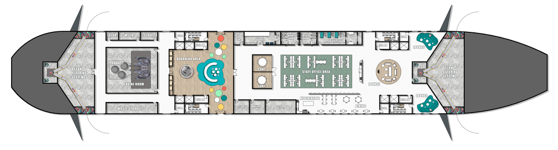
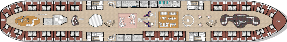
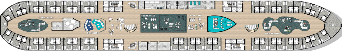
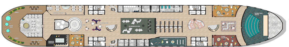
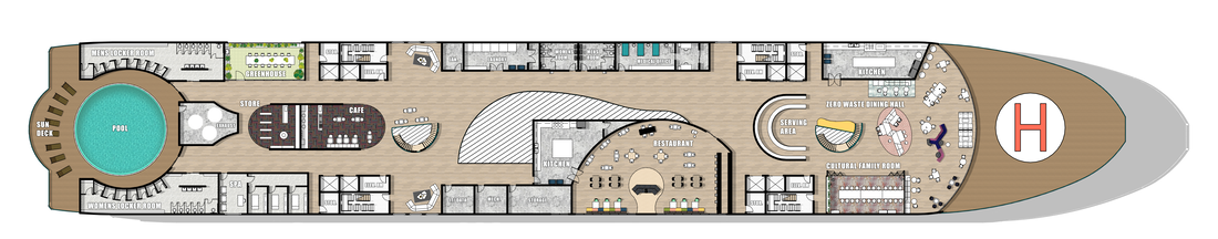
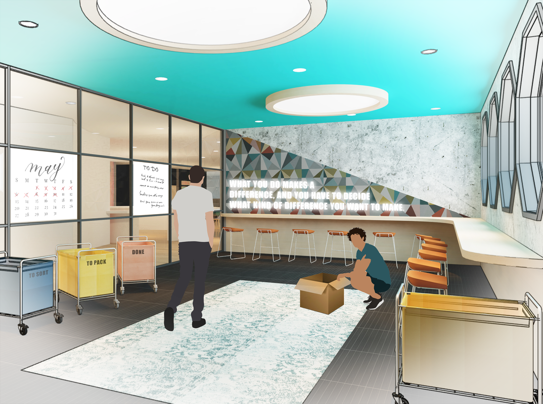
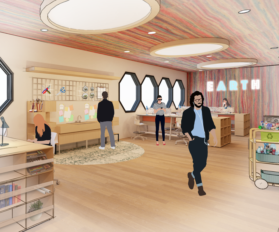
FOR MY SENIOR THESIS, I DESIGNED WAVES OF IMPACT, WHICH IS A SEMESTER AT SEA SHIP THAT INCORPORATES OPPORTUNITIES FOR STUDENTS TO PARTICIPATE IN COMMUNITY SERVICE, TRAVEL, UNCONVENTIONAL LEARNING, CULTURAL IMMERSION, SUSTAINABLE LIFESTYLES, AND AID TO DEVELOPING COUNTRIES. THE MAIN GOAL OF MY PROJECT WAS TO DESIGN SOMETHING THAT WAS TRULY BENEFICIAL TO THE STUDENTS INVOLVED, THE ENVIRONMENT, AND THOSE IN DEVELOPING COUNTRIES. SOME MAIN HIGHLIGHTS OF MY DESIGN ARE: AN OCEAN FILTERING SYSTEM, VOLUNTEER WORKSHOPS, RECYCLE ART STUDIO, MARINE BIO & SUSTAINABILITY LABS, DINE & DEMONSTRATION RESTAURANT, ZERO WASTE DINING HALL, AND A CULTURAL FAMILY ROOM. I RESEARCHED FOR A WHOLE SEMESTER TO UNDERSTAND THE TOPICS INVOLVED IN MY THESIS. THEN I USED REVIT AND PHOTOSHOP TO CREATE FINAL IMAGES TO DISPLAY MY DESIGN.
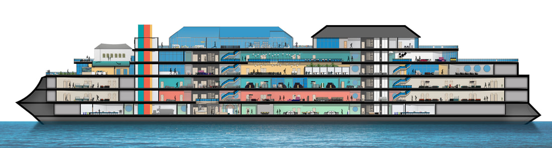 BOAT SECTION 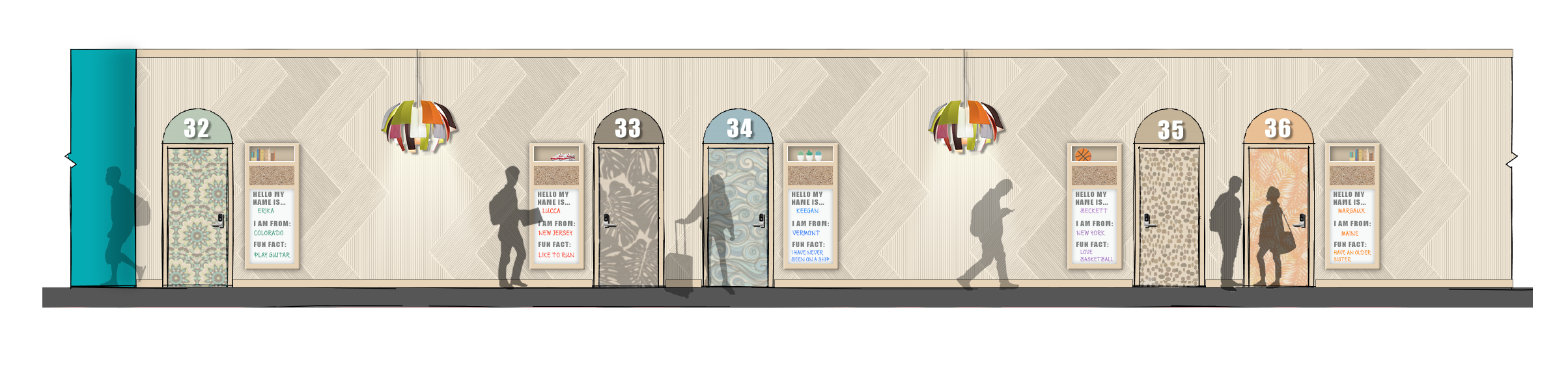 STUDENT DORMS ELEVATION 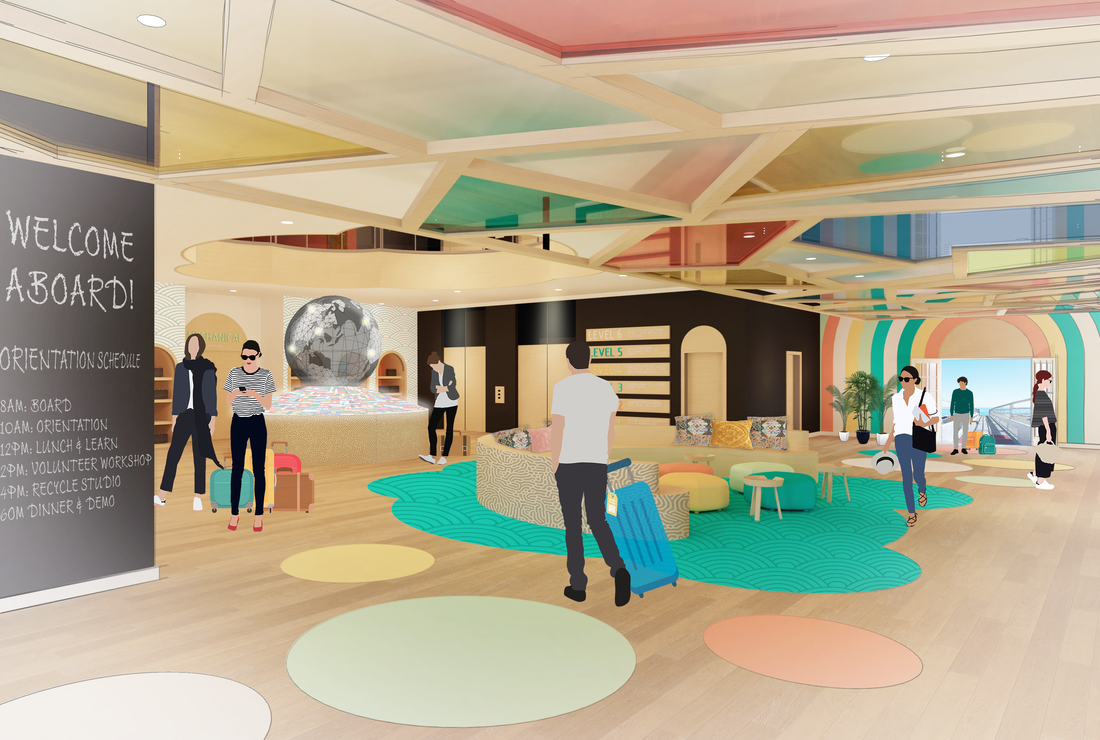 BOARDING AREA 1 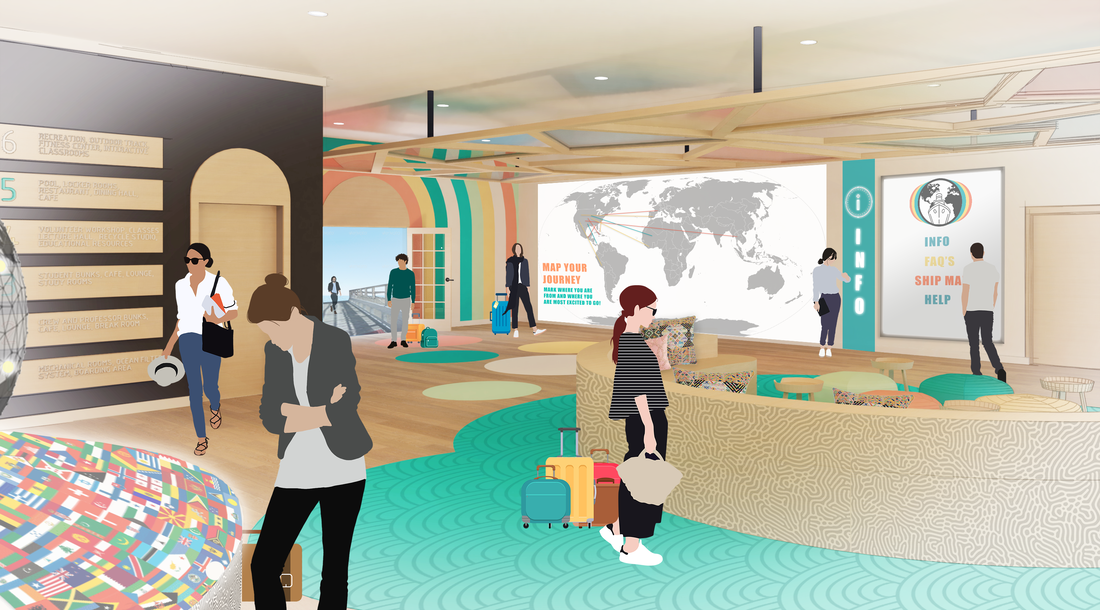 BOARDING AREA 2 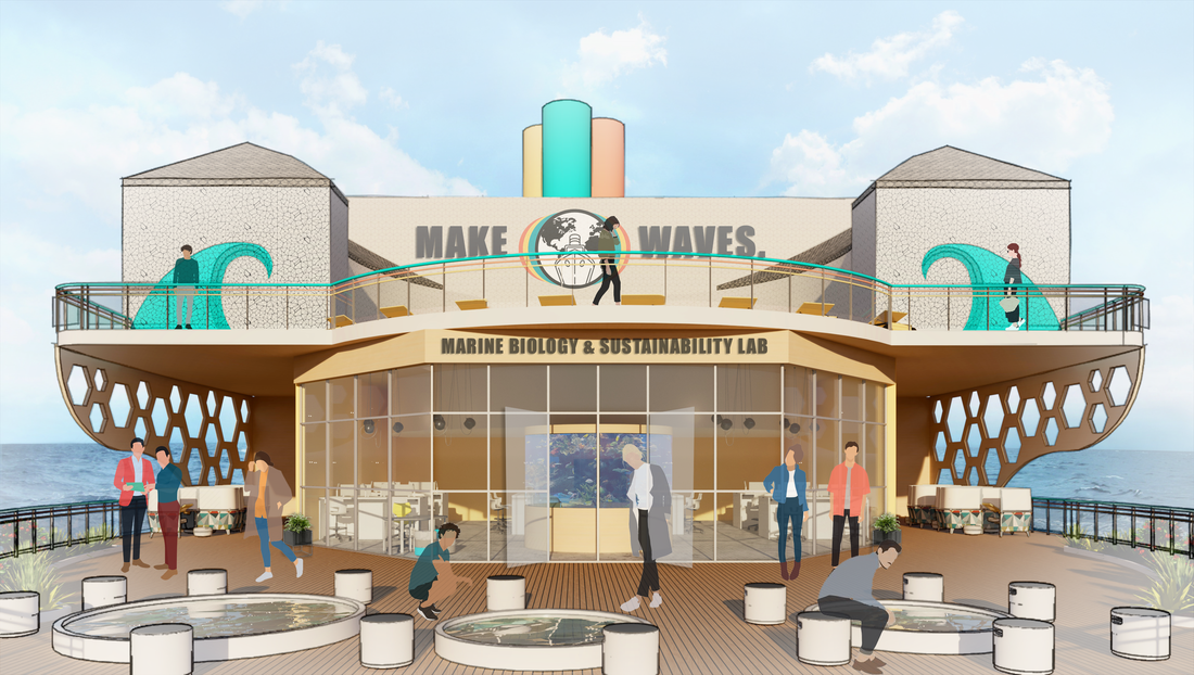 MARINE BIOLOGY & SUSTAINABILITY LAB 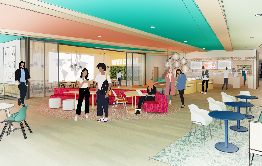 ZERO WASTE DINING HALL & CULTURAL FAMILY ROOM
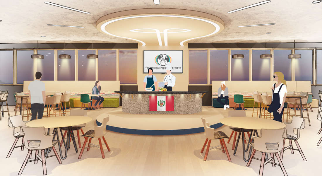 DINE & DEMONSTRATION RESTAURANT
0 Comments
i helped a team member explore some glass film designs for a corporate office. the glass film would help make the glass wall noticeable and provide partial privacy. I helped create the designs and i rendered them in photoshop. 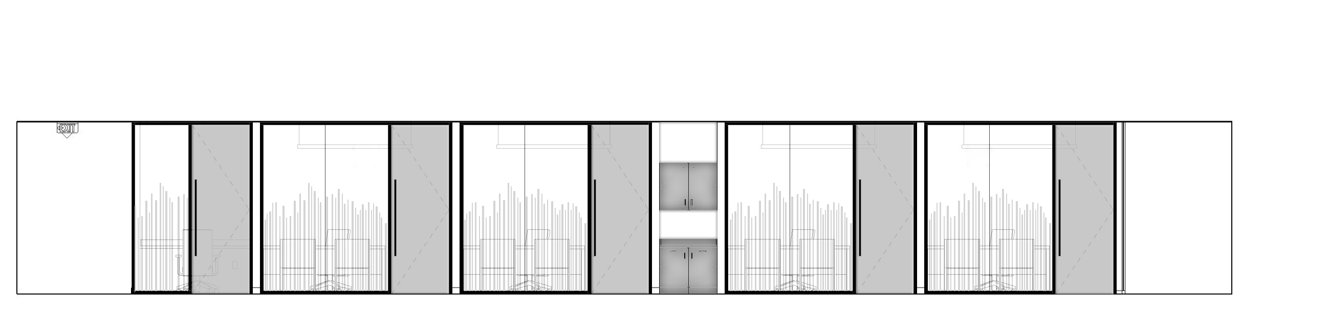 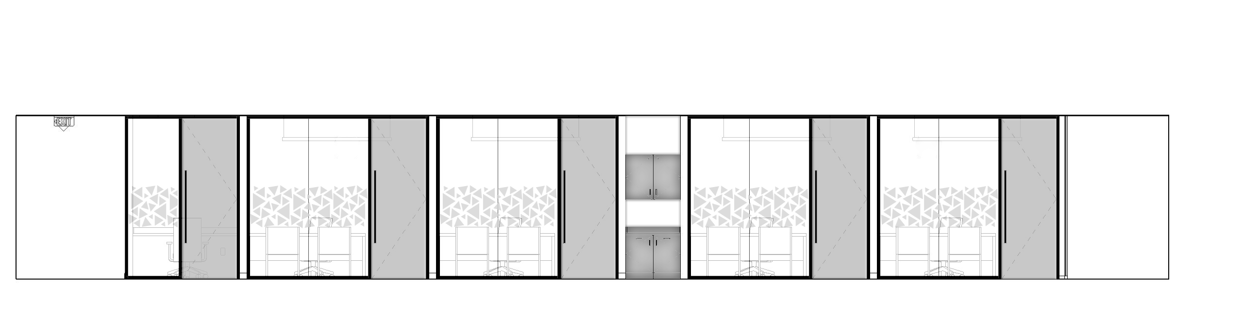 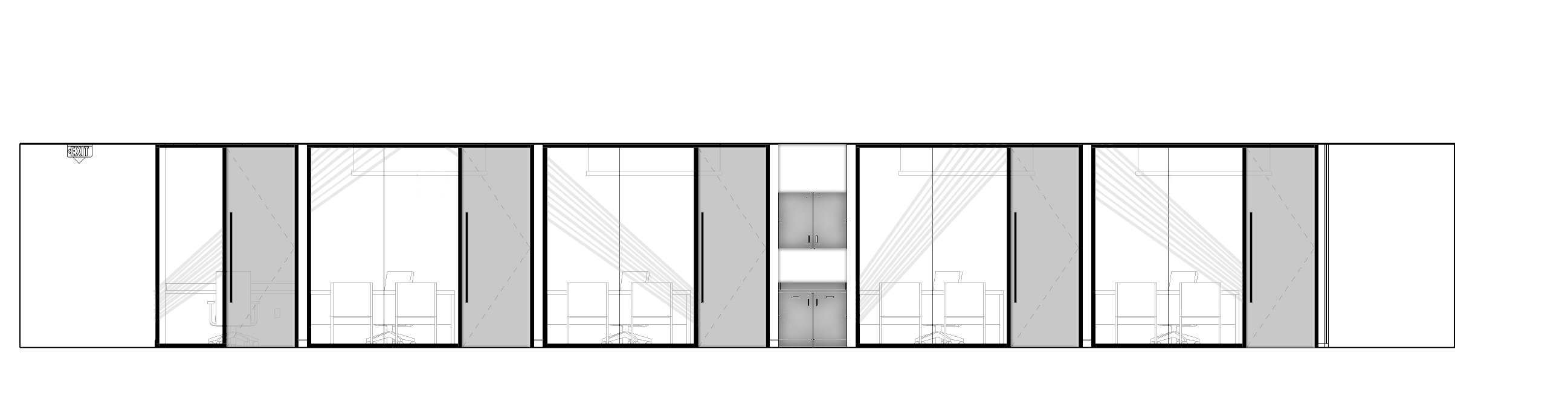 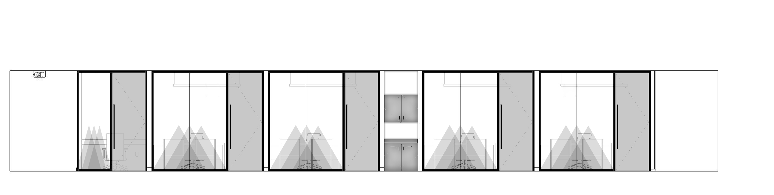 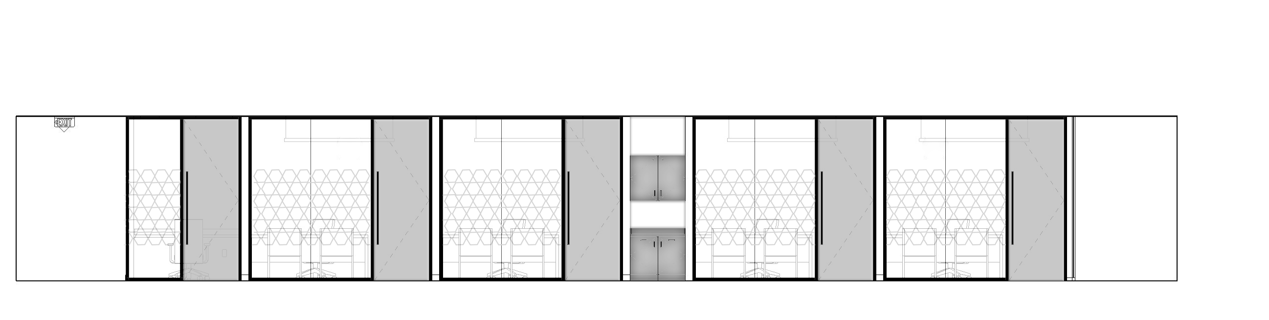 a team member at elkus MANFREDi asked me to help them with a quick study. they wanted to show the client different designs for the elevator lobby in the corporate office. we explored different materials, lighting, and 3-dimensional shapes. 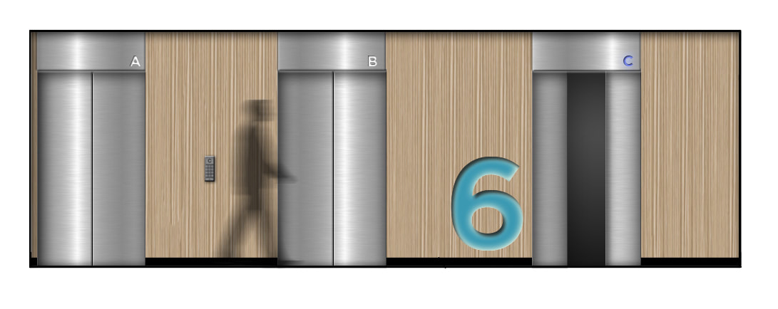 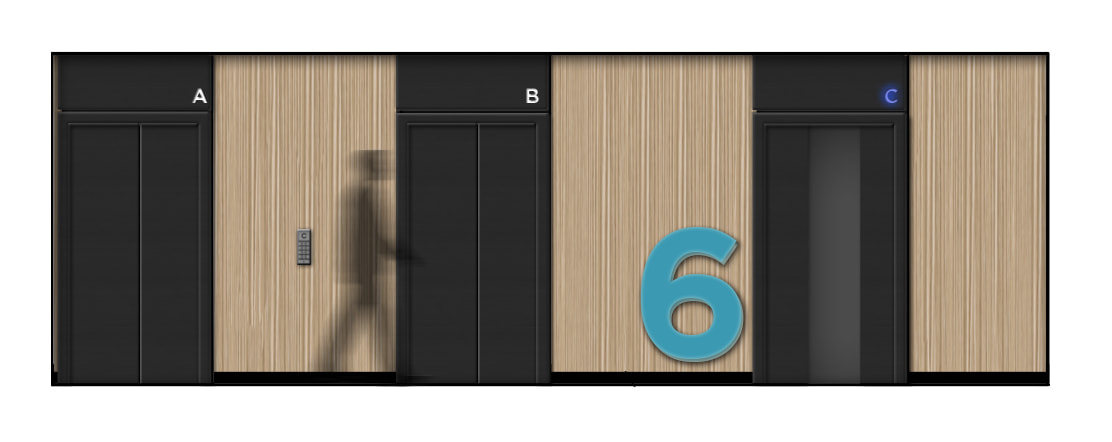 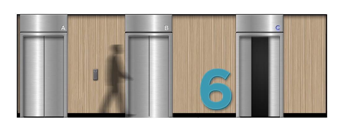 A PROJECT TEAM AND MYSELF WERE RESPONSIBLE FOR REDESIGNING AN OLD LIBRARY OF A WELL KNOWN LAW FIRM IN BOSTON. WE TURNED THE LIBRARY INTO AN INNOVATION LAB THAT HAD A FLEXIBLE DESIGN THAT COULD BE MOVED AROUND FOR DIFFERENT USES. I HELPED PROVIDE FURNITURE AND FINISH SELECTIONS, AND USED INDESIGN TO CREATE A FF&E PRESENTATION TO SHOW THE CLIENT. WE PROVIDED 2 OPTIONS FOR BOTH FURNITURE SELECTIONS AND FINISH SELECTIONS. 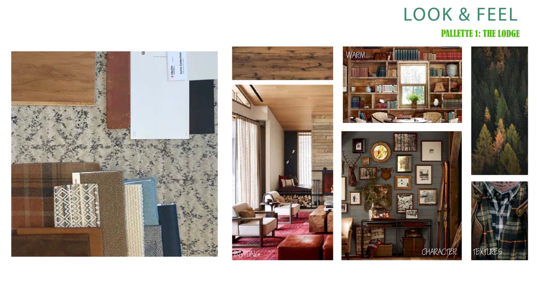 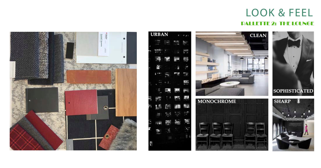 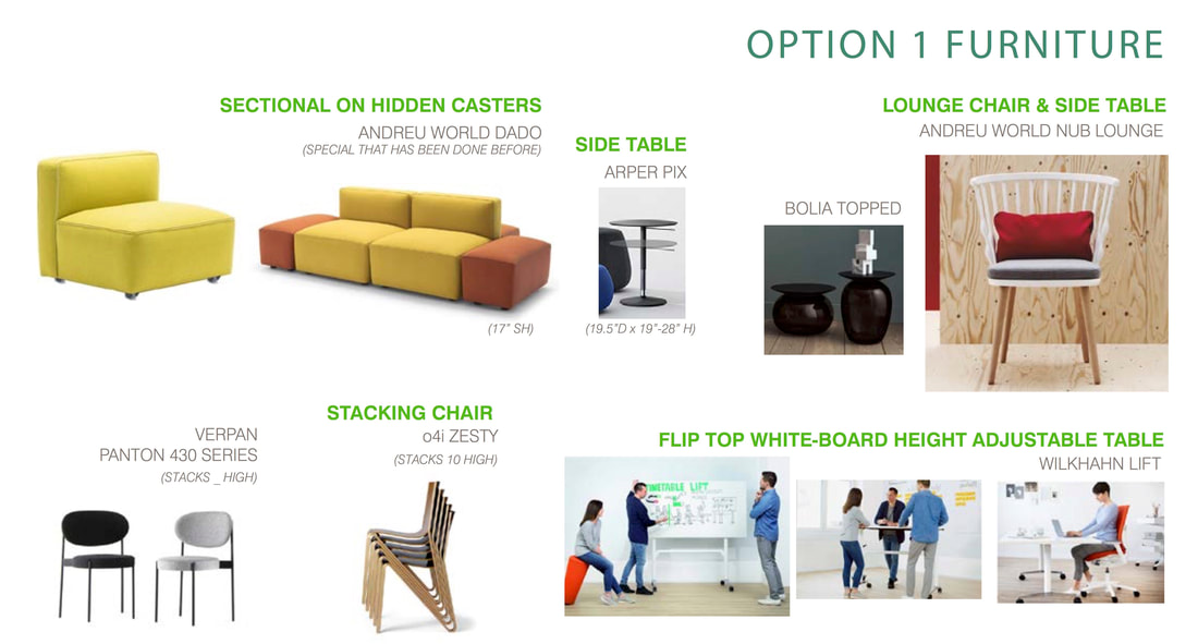 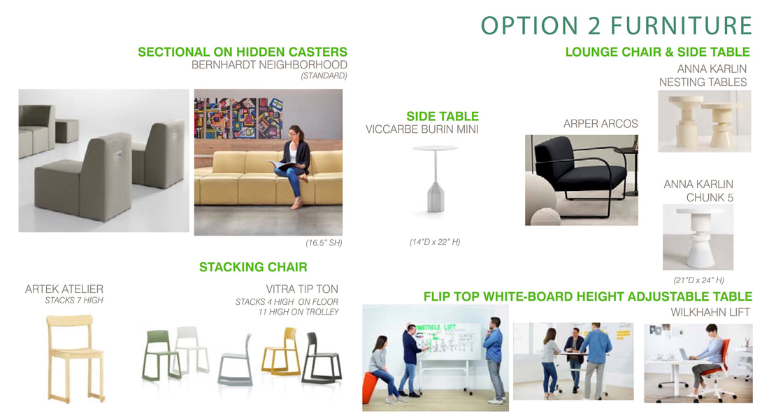 AFTER PRESENTING THE PREVIOUS CONCEPT FOR THE HOTEL DESIGN IN PROVIDENCE RHODE ISLAND, THE CLIENT WANTED TO SEE AN ALTERNATIVE CONCEPT SPECIFICALLY FOR THE ROOFTOP BAR. AS A TEAM WE RESEARCHED PROVIDENCE'S WATER FIRE, WHICH IS A GREAT TOURIST ATTRACTION FOR PROVIDENCE. WE CAPTURED THE FEELING OF WATER, FIRE, AND TOURISM IN PROVIDENCE. I RENDERED THE FOLLOWING IMAGES WITH REVIT AND PHOTOSHOP.  ROOFTOP BAR FLOOR PLAN  ROOFTOP BAR RCP  ROOFTOP BAR BANQUETTE ELEVATION  ROOFTOP BAR ELEVATION  ROOFTOP BAR WINDOW WALL ELEVATION - DAYTIME  ROOFTOP BAR WINDOW WALL ELEVATION - NIGHT TIME during my internship, I was able to help a project team with the design of a new hotel in providence rhode island. for the first concept we based the design intentions off of the once booming costume JEWELRY industry in providence. we designed the rooftop bar and master suites to capture the character of costume jewelry in a chic and fun way. I rendered the following images using revit and photoshop.  ROOFTOP BAR FLOOR PLAN 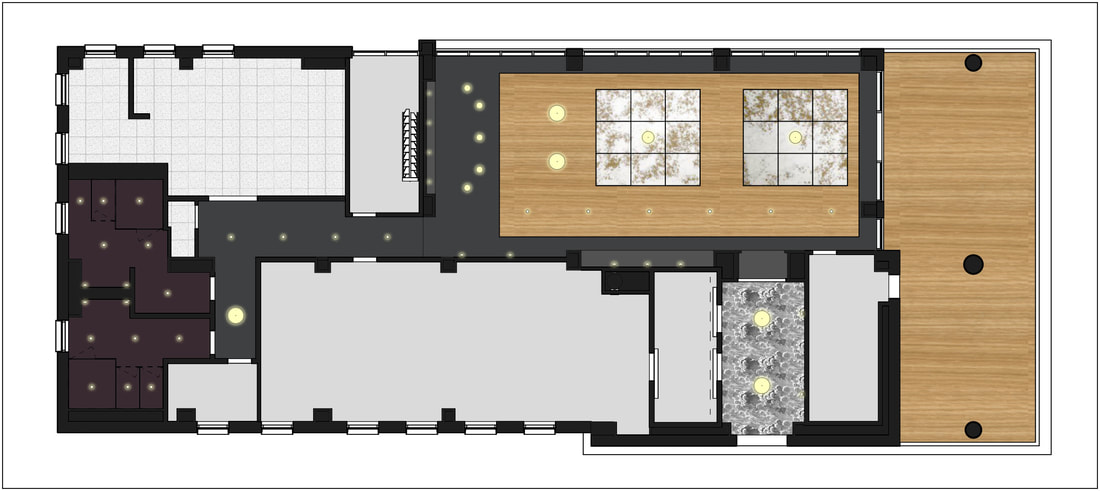 ROOFTOP BAR RCP 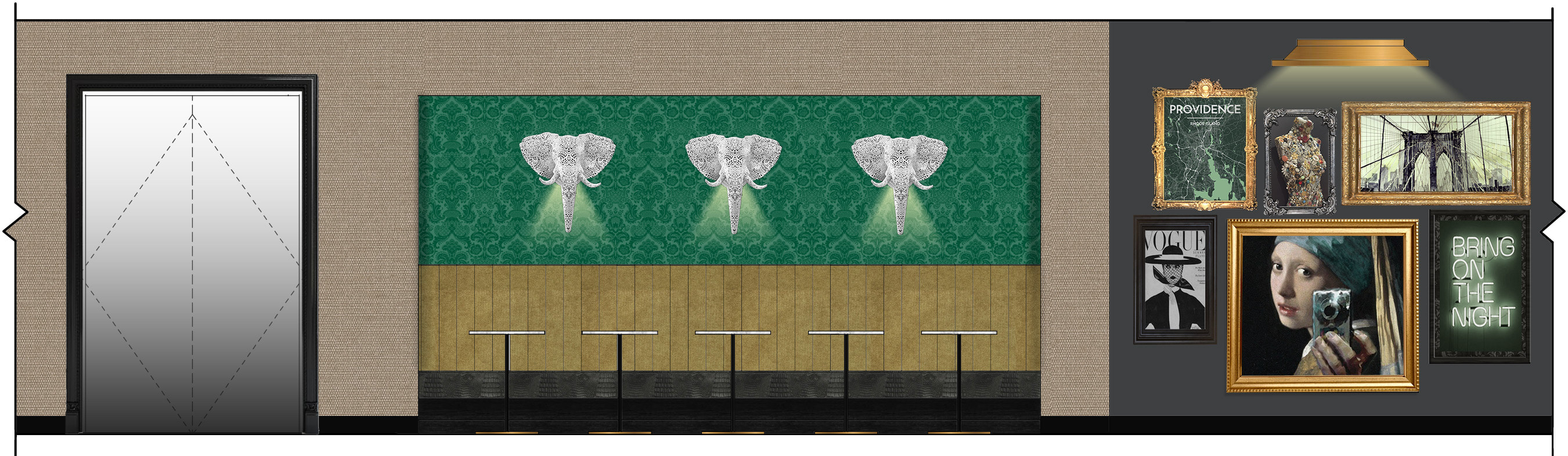 ROOFTOP BAR BANQUETTE ELEVATION 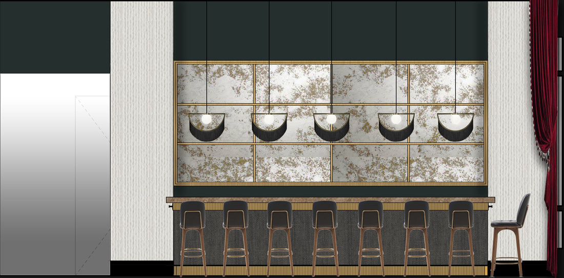 ROOFTOP BAR ELEVATION
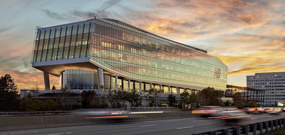
 MASTER SUITE ELEVATION I am happy to announce that I will be completing my fall internship at Elkus Manfredi Architects. I am super excited to explore the design field even further and learn so much from such a large group of talented designers.
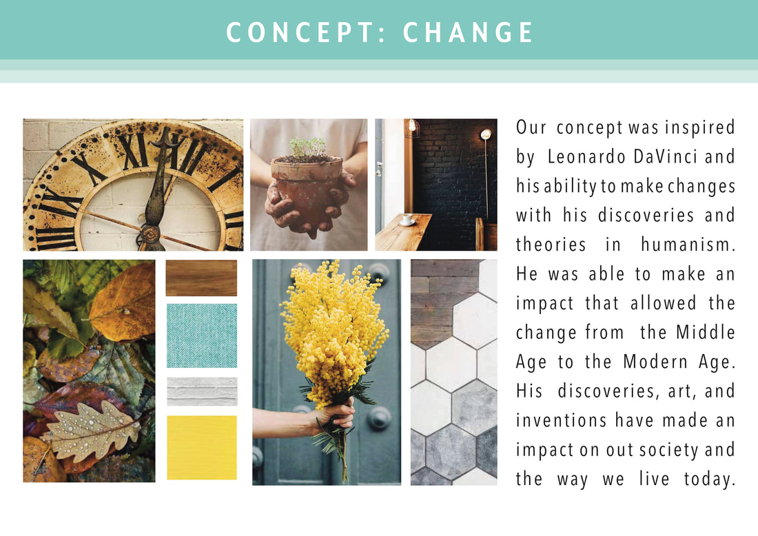
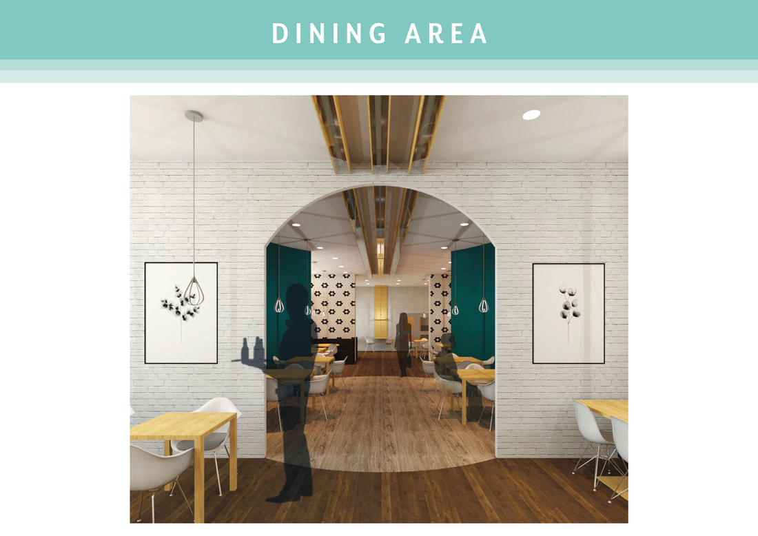
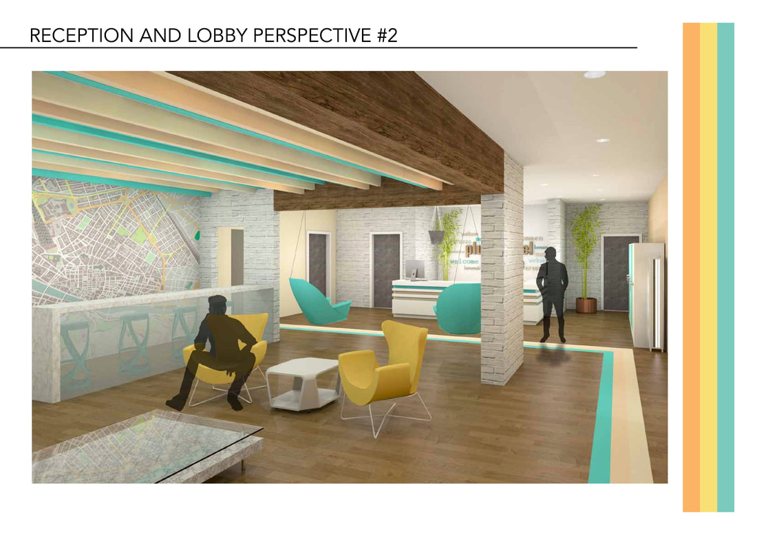
During my healthcare studio course we were tasked with designing a 3-story medical center. The program requirements of the hospital included: an emergency room, urgent care center, physical therapy suite, short term rehabilitation center, and a center of your choice. I chose outpatient infusion center because of my past experience at Dana Farber Cancer Institute. For my concept I used a lizard for inspiration, color tones, and patterns, because of the ability for lizards to regrow their limbs. Throughout the whole hospital I wanted to incorporate symbols or hope, strength, and determination. Schematically I wanted to adjacencies and locations of departments to be convenient to both the patients and staff. Healthcare design is a delicate balance between efficiency, functionality, and comfort. 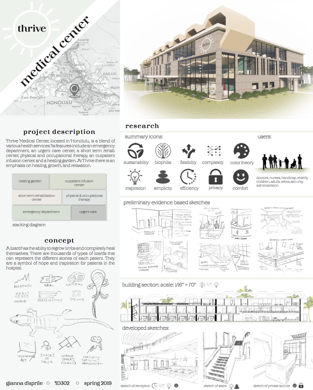 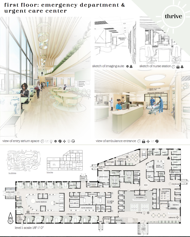 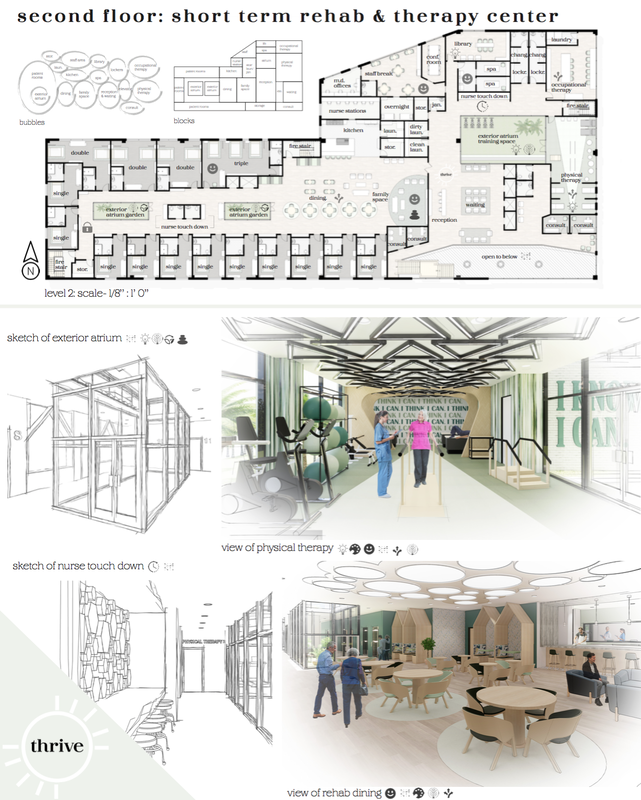 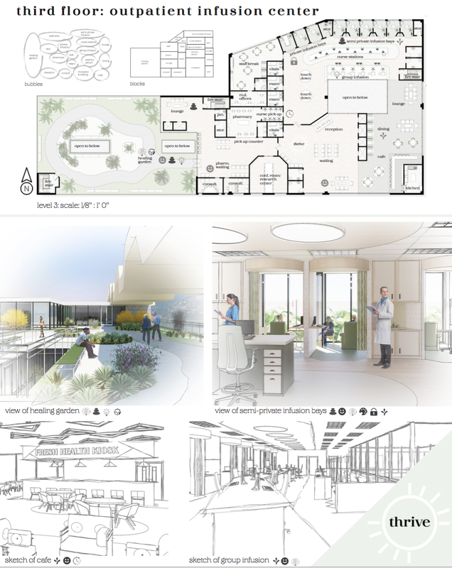
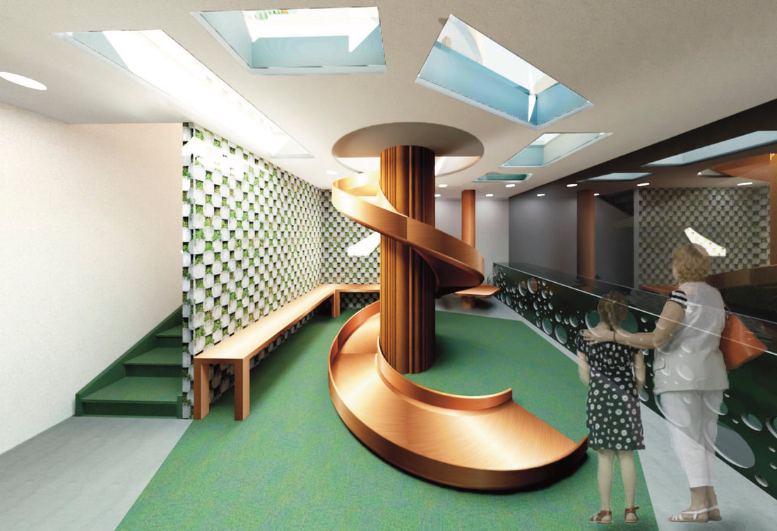
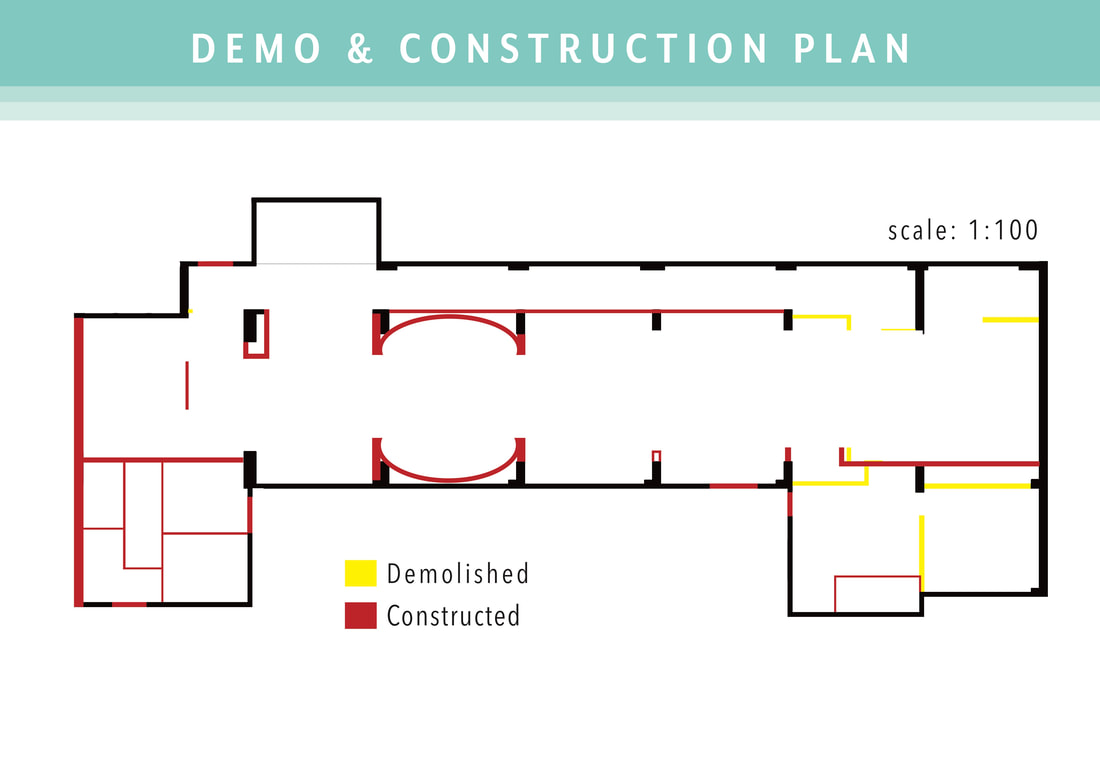
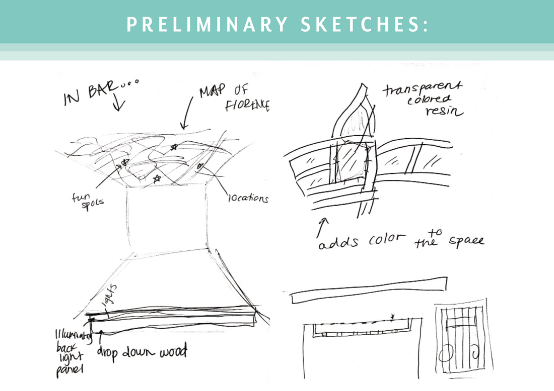
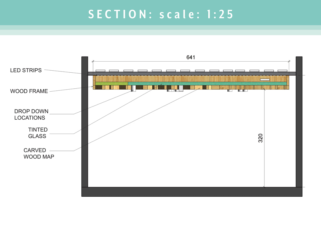
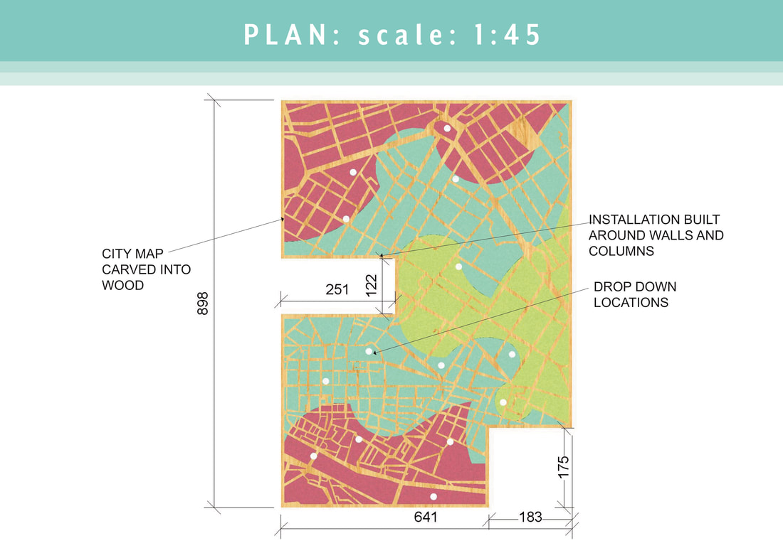
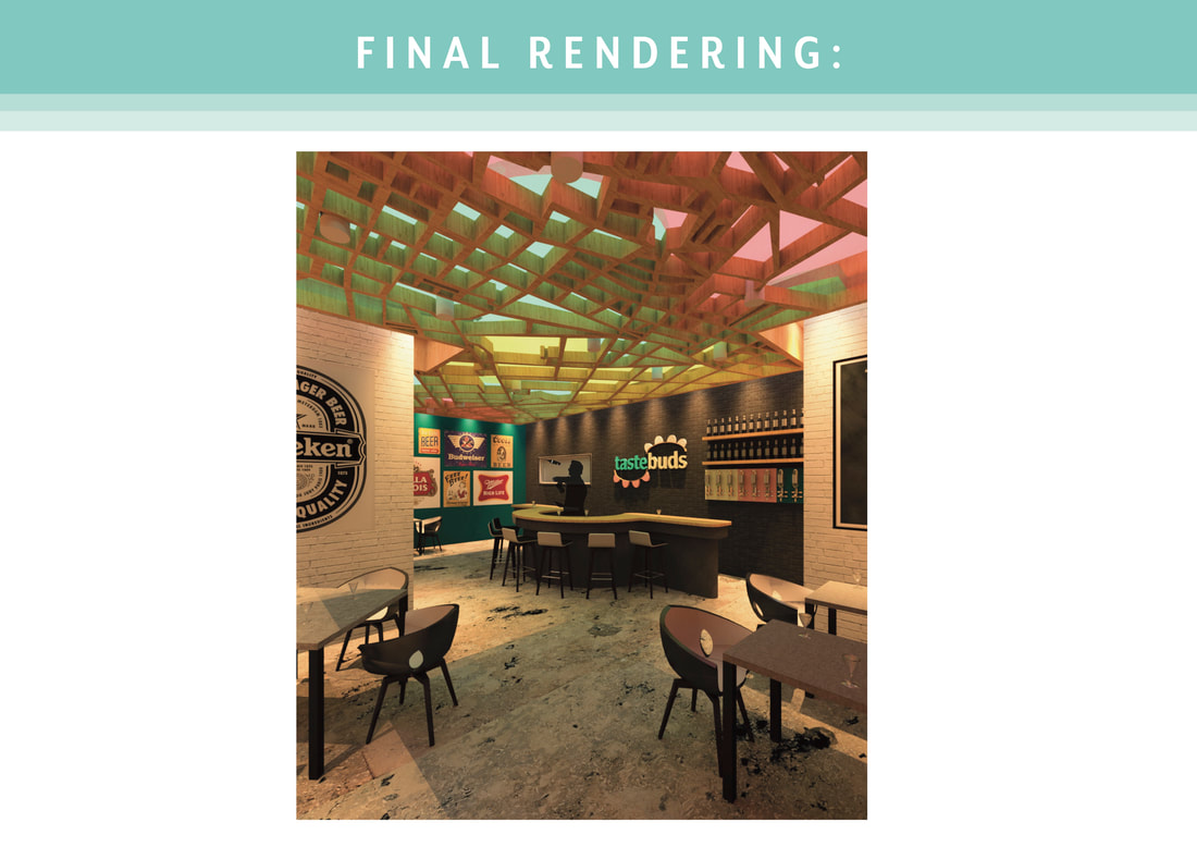
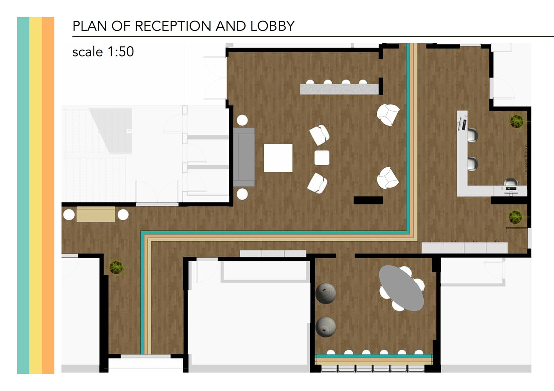
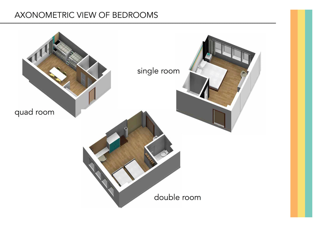
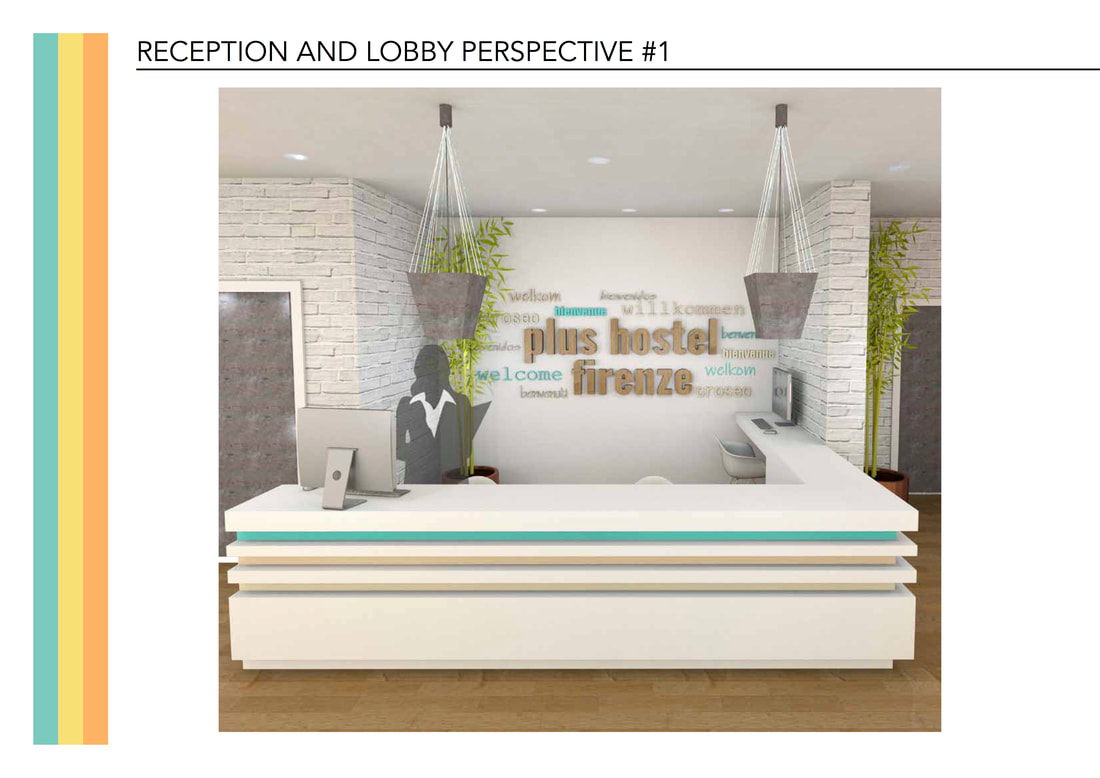
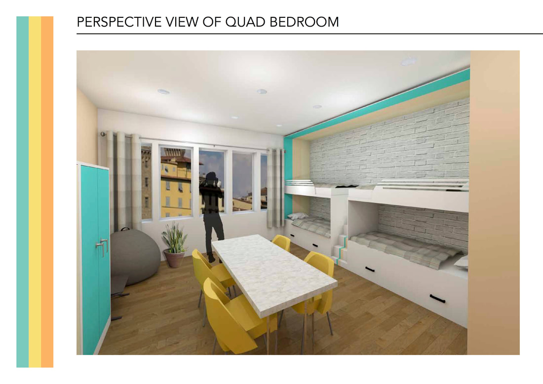
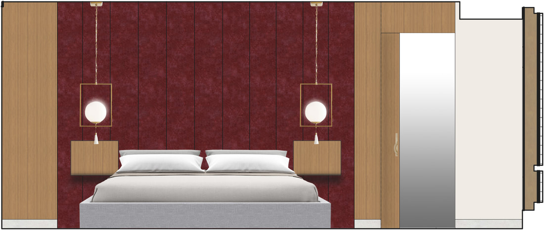
   In our Hospitality Studio, we had to renovate the Plus Hostel Florence's reception area and design a single, double, and quad bedroom. This group project was completed at the Florence University of the Arts. We developed a concept of energy and carried that concept throughout the entire space.
When I went abroad and studied at Florence University of the Arts, I took my first Lighting course. We learned important characteristics that are needed to create a light source. We designed our own lightsources to use in our Hospitality Studio Project.
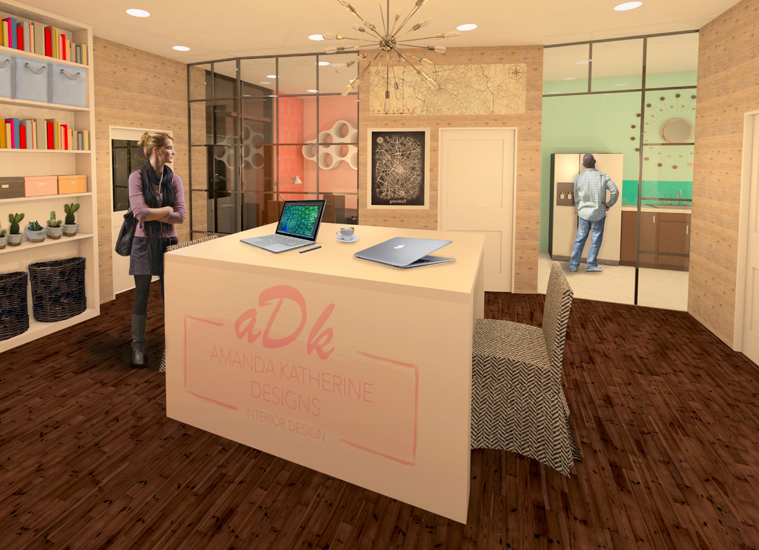
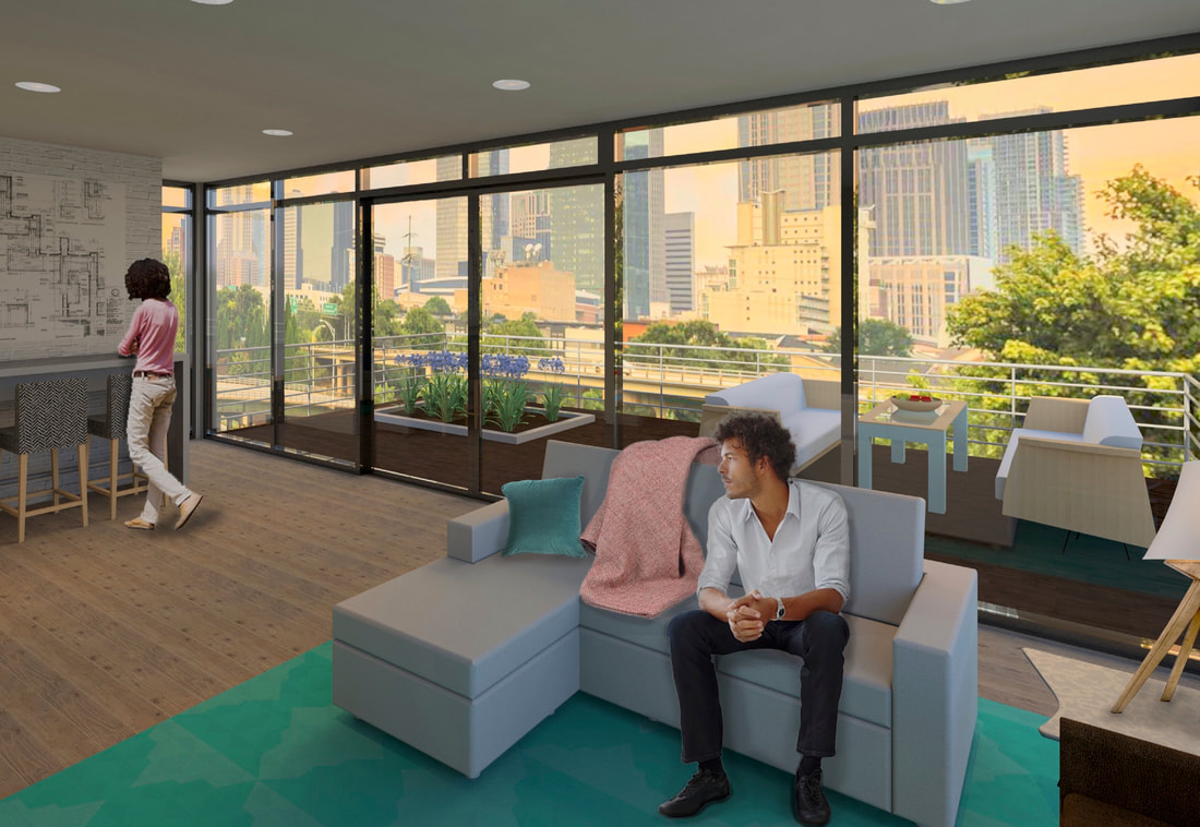
The following is a poster that explains my experience at my internship at Dana Farber Cancer Institute. The Internship lasted from May - July 2018. 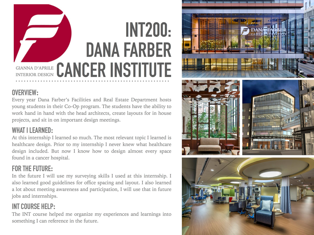 This Electronic Media Project was done to show us how to render without using the Revit Rendering Cloud, but instead using a combination of Graphic Display Settings and Photoshop. We studied semi-rendered, sketchy styles, shadow studies, X-ray studies, and consistent colors. I used the view from my Corporate Design Project, that is linked here. 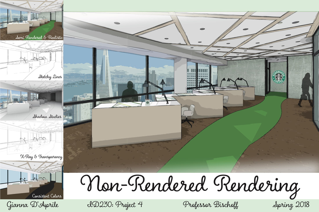 In our Corporate Studio class we had to choose a company and design a corporate office for them in an exisiting office building location in Boston, MA. I chose Starbucks and designed their workspace with the concept of interaction. This was one of the largest projects we had to complete with the most in depth Lighting Plan. We learned about specific building codes in our Codes class that we had to comply with in our project design. 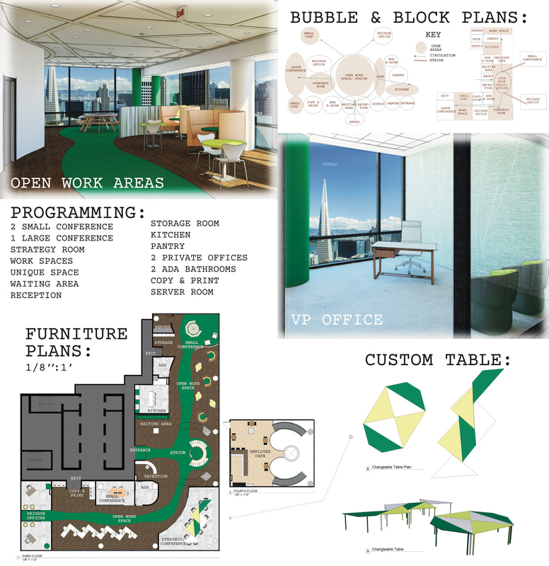 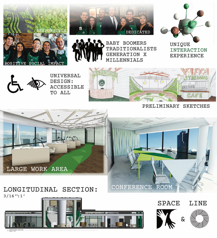 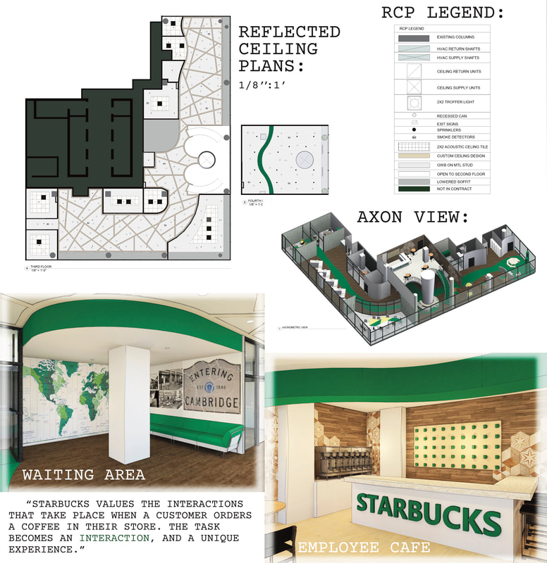 This project was completed in an Electronic Media class. We paired up with another student and designed each other's dream office space. Having a real client, we had to meet their needs, opinions, and design preferences. We learned how to use Adobe Illustrator to render floor plans, create boards, and make diagrams. We used Revit for the renderings of the perspectives.
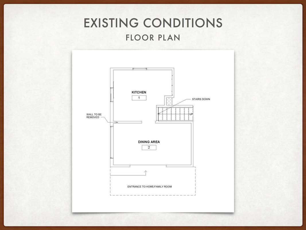
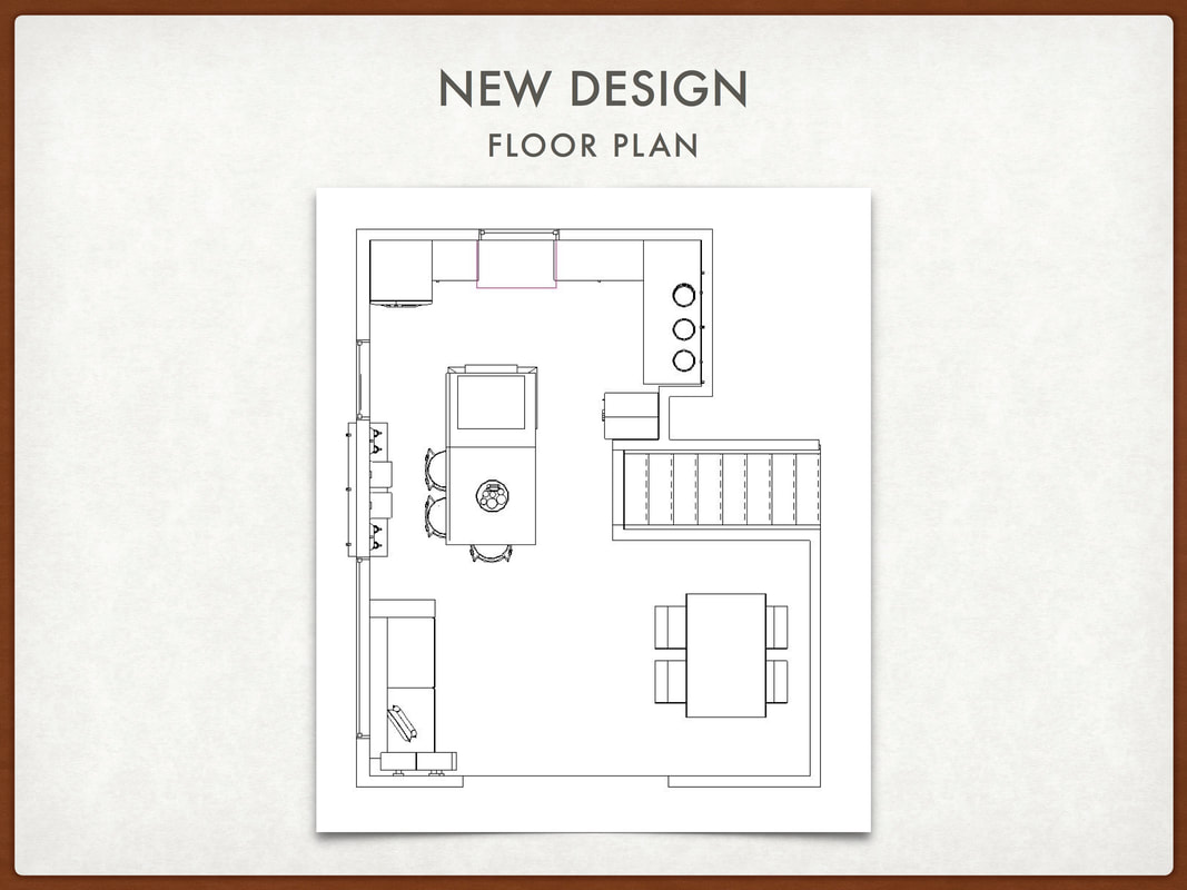
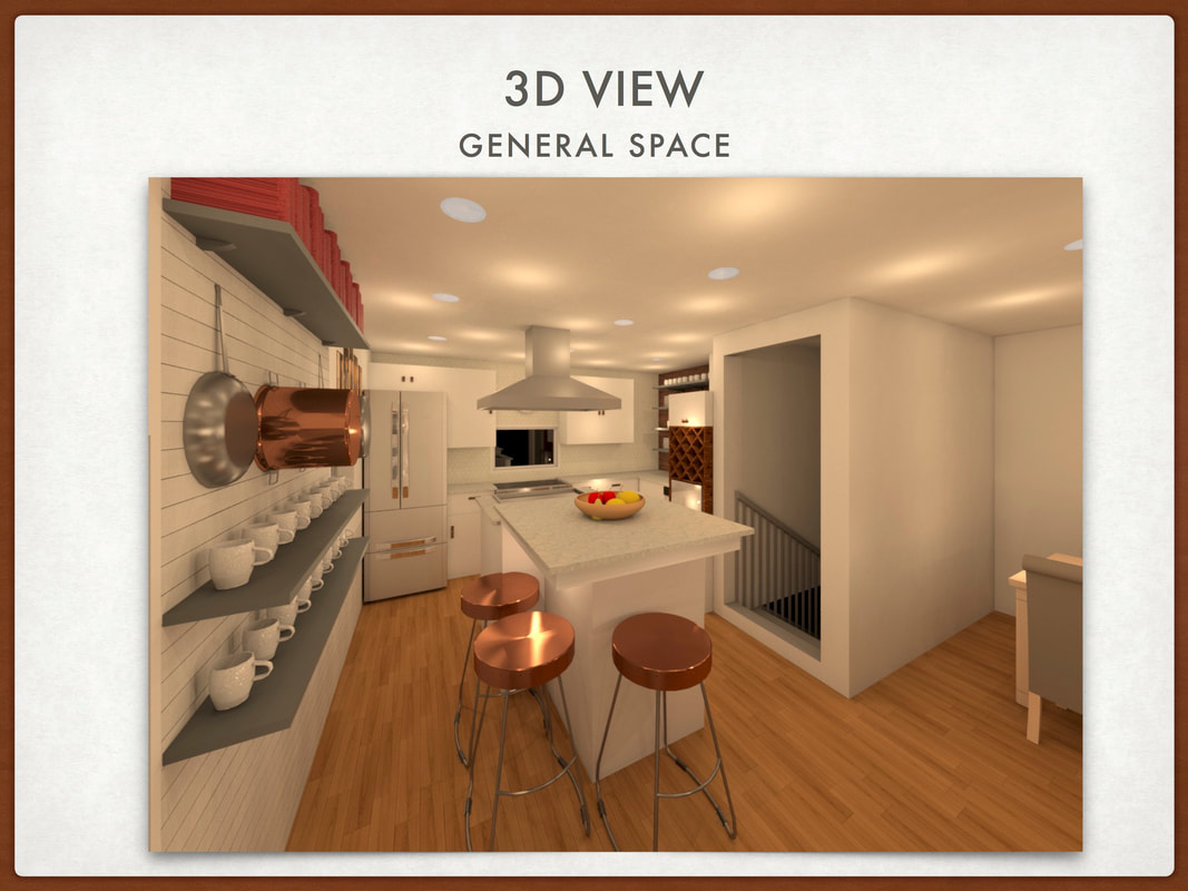
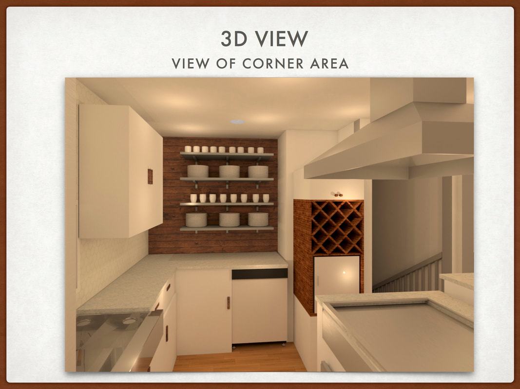
  This was a quick research assignment that our group completed to understand office design and how it has changed throughout the years. This is a good resource to use for future projects.   This project was an introduction to Adobe Illustrator. We had to think of a concept and create a textile based from it. I chose glacier melt and created the textile in 4 different colorways. For an additional assignment, we used Adobe Photoshop to place the textile on products. We used Spoonflower to have the textiles printed on real fabric for the day of the presentation. 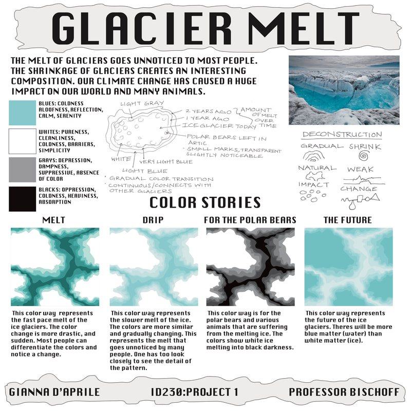 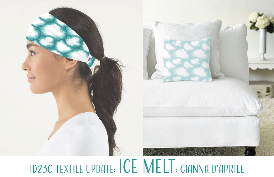 My cousin and his wife were renovating their kitchen and asked for my help. Over break, I created drawings of his existing conditions, the new floor plan, and some example renderings of what the space could look like. They really appreciated the design and kept it in mind for their renovations.
  These renderings are finals I completed in my Media Rendering class. I used colored pencil, marker, pastels, watercolor, and graphite pencils to complete the following drawings. The exterior piece in the bottom right was chosen to be displayed in the Student Exhibition at the Visual and Performing Arts Center at Endicott College. Our class had the opportunity to compete in the Pave Student Design Challenge. We had to create a powerwall and cashwrap for The Body Shop. Pave would fly the winning group of the challenge to Chicago to display their work in a convention and have their design built in a mockup. My partner and I came up with the concept enrich, because of the environmental values of the company. My group's design was well recognized by PAVE, but we did not win the challenge. However, our work was chosen to be displayed at the Student Exhibition in the Visual and Performing Arts Center at Endicott College. 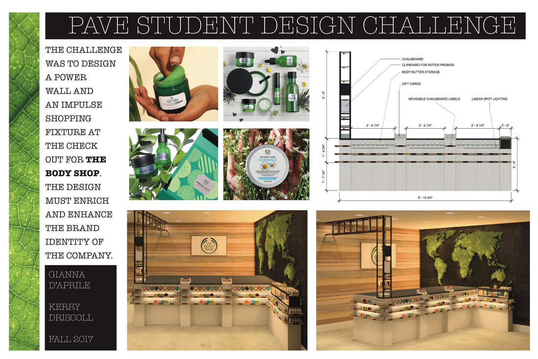 This project was completed in my Electronic Media Course. This course was our introduction to Revit. We chose an exisiting space and had to recreate it to the best of our ability in Revit. At the end of the project we compared the photograph to our renderings. This was a very detailed and time consuming project, but the results were rewarding. 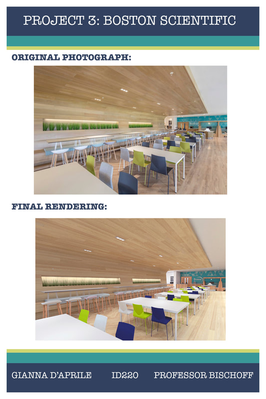 |